How to make your online and blended classes more accessible

As we enter another semester with the looming presence of COVID, many of us are preparing our classes to be online or as blended as possible. Last Spring, many of our schools and businesses moved online within days, but many of us weren’t prepared for that to happen. Even for this Fall, many of us have had to scramble to get our classes made for online environments.
However, the silver lining to this dark year is that many of us are learning about the benefits of accessibility in our online classrooms. Despite the terrible consequences of COVID, we are now in a time when learning is more accessible than ever before.
As we prepare our materials for this semester, and every semester, we need to ask ourselves how we can make our courses usable for all students, including those with disabilities. Even before COVID, we were supposed to be creating accessible materials for our courses. The reality is that universal design and accessibility will be primary considerations for course design as long as we have people to teach. So how can we optimize our materials for online environments to make them usable for all students? To better understand this, let’s dig into how our online materials are assessed.
How are online materials assessed for accessibility?
The World Content Accessibility Guidelines (WCAG)
 The World Content Accessibility Guidelines, or WCAG, is a set of specific standards designed to make the web more accessible to people with disabilities. This guide has been in use and iterated on for over 20 years. WCAG can evaluate marketing sites, our favorite blogs, and really anything that can be accessed online.
We won’t go into all of WCAG’s considerations in this article, but you should know about it to understand how online materials are assessed for accessibility. WCAG can read as highly technical, but we will discuss the most common considerations for course design and boil down the essential elements.
The “POUR” Principles
WCAG is broken into four guiding principles stating that web content must be perceivable, operable, understandable, and robust, spelling out the acronym “POUR.”
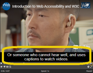
- Perceivablemeans removing any barriers to accessing our content by providing alternative methods of access. Some examples of this include video captions for a person who is hard of hearing or deaf or support for screen reader technology for someone who is low vision or blind.
- Operable means that our content, along with anything interactive on it, can be controlled through various tools. For example, ensuring our content is accessible to people who don’t use a mouse to navigate the web and instead rely on their keyboard.
- Understandablemeans to utilize language and functionality that is easy to comprehend and consistent. For example, before writing “WCAG,” I explained that “WCAG” stands for “World Content Accessibility Guidelines” to inform you what this acronym means rather than assuming you already know or remember.
- Robustmeans that our content should work well across different platforms, technologies, and devices within reasonable limits. For example, ensuring that the tools we ask students to use are accessible on different browsers such as Chrome, Firefox, or Safari.
These four principles act as categories that hold all of the specific guidelines from WCAG, and each guideline has a rating system.
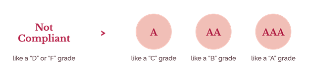
The A to AAA Acceptance Levels
The A, AA, and AAA ratings are a system used to indicate compliance to WCAG with A being the minimum level and AAA the maximum level of compliance. When our online class content is assessed, we review accessibility within an interface (what is on a website or platform itself) and materials provided (such as videos, PDFs, etc.).
In teacher terms:
- An “A” rating is like a “C” grade.
- A “AA” rating is like a “B” grade.
- A “AAA” rating is like an “A” grade.
No effort to meet accessibility requirements tends to lead to something like a “D” or an “F” grade. But before you worry too much, I want to level-set here: there is no application, website, or online class entirely AAA compliant in every category or every location. The reality is that most experiences have a range of acceptance levels and different pieces factor into our class’s accessibility, some of which we have more control over than others.
That isn’t to say that you shouldn’t try, but rather that you should know that these ratings can vary depending on the need. In some cases, there is no AAA rating for a specific requirement.
With that in mind, let’s discuss where we have the most control and responsibility for course accessibility.
The Three Factors That Affect Course Accessibility
We have three primary factors that affect our ability to make our course accessible: our learning management system (LMS), third-party tools we may be using, and content we and fellow faculty are generating. We’ll talk about each of these and break down the control level we have when using them.
Learning Management System (LMS)

The first factor of course accessibility comes from the Learning Management System that we choose or our institution uses. Some examples of these include Desire2Learn, Moodle, and Canvas. We may have used these for anything from developing entirely online courses to only displaying grades and quizzes. Many of us have experience using these but are likely using them more now than ever before.
We have a low level of control in our Learning Management Systems because most of the accessibility in those platforms comes from how they are built and how our institution may have customized it. The good news is that many students with disabilities have the greatest success in accessing web content when presented using a consistent layout, so it is usually beneficial to be using an LMS. Many of these LMSs have whole teams dedicated to meeting the WCAG standards we just discussed.
When there is an accessibility issue, it usually is from color contrast and usability for people who rely on keyboards and screen reader technology for access. Even though we typically can’t fix these issues ourselves, we should still work with our institution or the system provider to resolve accessibility issues if/when we see them.
Third-Party Tools
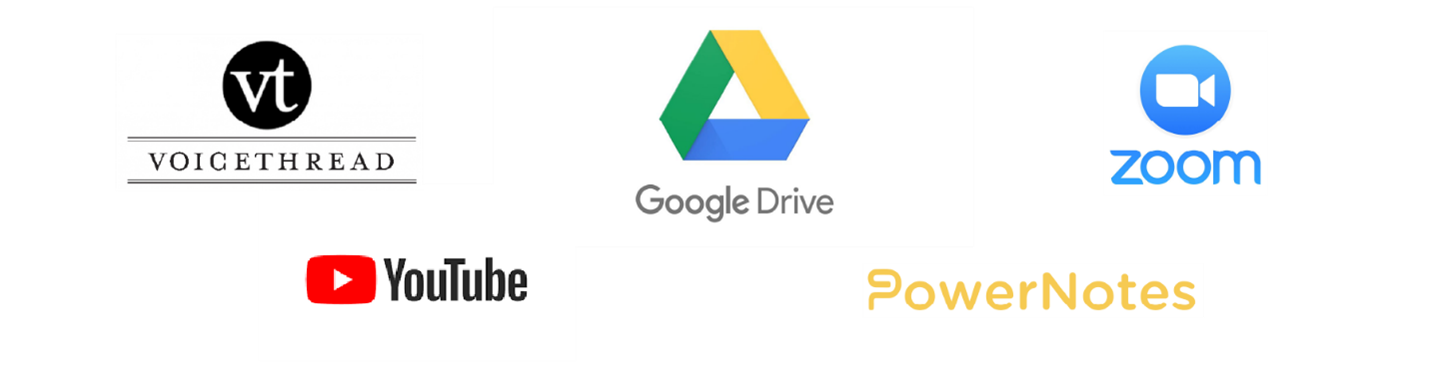
The second factor affecting accessibility in online courses is third-party tools. This can include tools such as Google Hangouts, VoiceThread, Zoom, and more. We have more control over third-party tools because we generally get to pick the tools we want to use to apply to our courses’ purpose.
Since we typically get to choose these tools, it’s important to vet them to ensure that they are actively considering accessibility. Much like Learning Management Systems, third-party tools tend to have ongoing support and documentation for inline with WCAG considerations. For example, if we were to Google, something like “add captions to YouTube video,” there is documentation to help support that. To provide fully integrated accessibility in these tools, we also have to ensure that we use the baked-in accessibility functionality they provide. It’s not enough to have Googled if you can add captions to your YouTube video, you have to go through adding those captions.
In either a learning management system or a third-party tool, we can work with their support teams and request updates when something is inaccessible. The more we speak up about accessibility concerns or ask for assistance to make our content accessible, the more likely accessibility is prioritized and improved. We must voice those concerns to make these and other products more accessible.
But even in a fully accessible LMS or third party tool, an instructor or course developer can quickly create an inaccessible course by creating inaccessible pages within the class or uploading inaccessible content to the course, which brings us to our next consideration.
Faculty Generated Content
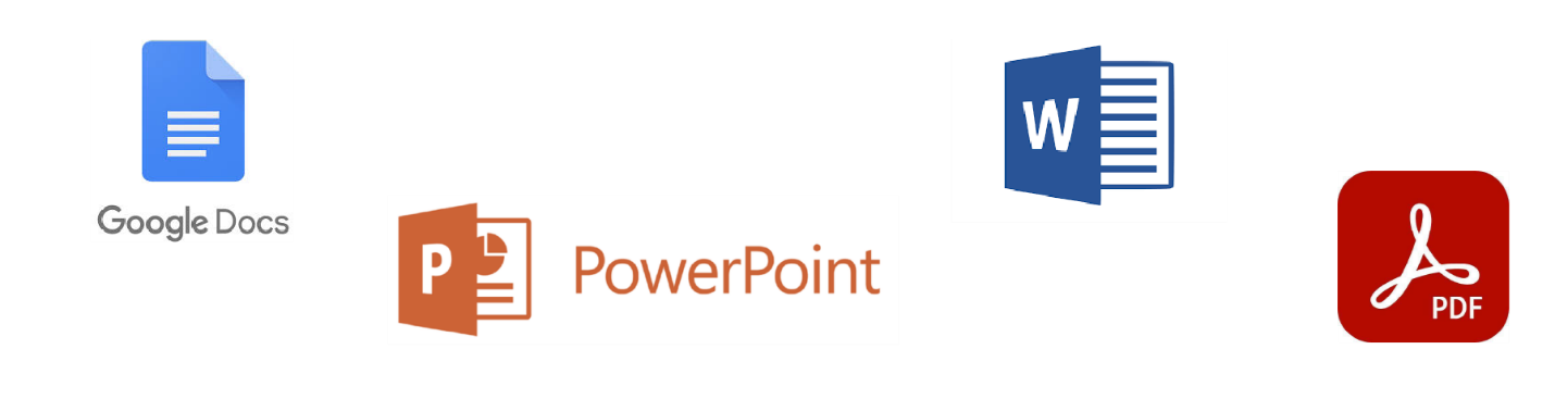
The final factor of course accessibility comes from faculty generated content. This is usually content created and cultivated by ourselves, our departments, and instructional designers. These documents are generally Word Docs, PDFs, images, audio, etc. Faculty generated content is where we have the most control and the most responsibility in ensuring accessible course design.
Many of these materials are re-used for years, and often the updates required to make them accessible tend to be minor compared to the amount of use they receive. The best approach is updating as we go, improving materials we are actively using semester to semester so that we don’t find ourselves having to make sudden and unexpected accommodations. The good news is that tools like Microsoft Word, Google Docs, and more almost always have baked in accessibility functionality that we can use.
Since these materials are often generated across different faculty members with varying degrees of accessibility knowledge, it’s essential to actively communicate issues as we encounter them and work with our faculty and departments to improve. If you are struggling to implement accessibility in the tools you most commonly use, I recommend asking for support from your campus. Many institutions have dedicated faculty on staff for the express purpose of course accessibility.
The Most Common Accessibility Considerations for Educators
These considerations will build on everything we’ve discussed so far and show you the most common places for you to be considering WCAG principles, whether you are in an LMS, third party tool, or content creator like Microsoft Word. But keep in mind that these are only common accessibility considerations for educators, so they do not capture every WCAG guideline. Specific situations may call for different considerations, so be sure to be mindful.
Syllabus Design
Believe it or not, our syllabus plays a crucial role in our course accessibility. Making things clear and easy follow is essential because students regularly come back to the syllabus throughout a semester, especially if we’ve organized it in a meaningful way. Use the following tips as you develop your syllabus:
- Outline clear expectations for the class
- Outline topics you’re going to cover, ideally in modules or by week.
- Organize materials in a meaningful way
- Make assignments clear, describing them in the syllabus if possible
- Include a rubric for how you will grade those assignments
- Make it easy for students to contact you for accommodations
- Include info for campus resources for students with disabilities
- Include campus issued statements on inclusion for students of all backgrounds
Learning Management System Setup
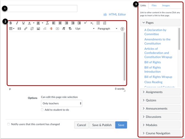
Much like in our syllabus, consistency, and clarity is critical in our learning management system setup. It’s highly valuable to organize content to make it easy for students to navigate the course. Use the following tips to set up your class in your Learning Management System:
- Avoid having one long page with everything in it, and instead, have meaningful modules broken out in individual pages so that students can skim for what they need then access it with ease.
- Name uploaded files logically and uniquely so that students can more easily find them, particularly students with screen reader technology.
- Use the LMS editor to share content because it tends to be easier to access for students with disabilities. It can be beneficial to write up documentation within our LMS rather than as a document like a PDF because the code is often more accessible for students using assistive technology such as plugins that increase the font size or color contrast.
Content
No matter where we are writing content, the content structure principles remain the same. It’s important to remember that when we apply a style to text, that style is not just used visually but also programmatically. When I say programmatically, I mean in a way that a computer can recognize and adequately interpret for students using tools like screen readers. Writing strong content and using programmatic styling ensures that our content structure is communicated to all students without relying on visual hierarchy alone.
Headings
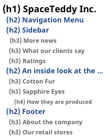
- Do not use heading styles because of how they look; use them to reflect your content structure.
- If you want to use a specific style for a piece of content, I recommend customizing or adding new styles rather than misusing existing elements.
- Heading structure should be hierarchical (for example H1, H2, H2, H3, etc.) rather than out of order (for example H1, H3, H2, H3, etc.)
- Headings should accurately describe what is on a page briefly and succinctly.
Links
- Avoid putting too many links on a page.
- If you customize the style of a link, ensure that the link stands out from the content surrounding it, using color, written text, or underlines to indicate where it is.
- Write unique link text that explains where the link goes and its purpose.
- Avoid having links that say things like “more details” or “learn more” because this doesn’t inform your students why they should select it
- Be cautious of linking directly to a URL (for example, https://uxdesign.cc/8-faqs-about-accessible-ux-7c5a372a1ffb) because screen reader technology reads the full length of that link text aloud, which can be long and tedious. If you do link to a URL, shorten the URL link using lyor TinyURL.
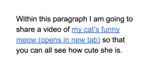
- If a link is set up to open in a new window or download content, ensure that students know this will happen. It can be exceptionally disruptive to students, especially to those using screen reader technology. You can use parenthesis next to the link text to specify it acts automatically. (for example, my cat’s funny meow (opens in new tab))
Readability
As instructors of challenging courses, it can be difficult to make our content easier to read. Still, in most cases, easy readability comes from providing guidance on the meaning and having good structure. While this can be contrary to what we have learned in academia, better readability can help students who have difficulty focusing or have reading disabilities like dyslexia. To improve readability in your writing, use the following tips:
- Write in short, clear sentences.
- Break up blocks of text into separate paragraphs
- Use bulleted lists
- Highlight keywords or phrases
- Reduce word count where possible
- Avoid using unnecessarily complicated words and phrases.
- Expand acronyms on first use (for example explaining that WCAG stands for Web Content Accessibility Guidelines)
- Provide context for idioms, abbreviations, and jargon
- Consider providing a glossary for terms students may not know.
- Ensure that instructions on assignments are written out and clear. If you’re ever wondering if the instructions are clear, I recommend regularly asking students for feedback on assignments.
If you’re looking to assess your content’s readability, I would recommend using tools such as Hemingway Reader.
Color
Color and visual design tend to come into play when we can change the color of content in documents, or in interfaces that allow us to customize colors.
Color Usage
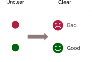
- Don’t specify information by color alone because not everyone sees or interprets color the same way.
- If you are going to use color to enhance the way you communicate something, ensure that you pair it with a label or another element that provides your students don’t need to see color a certain way to understand something.
Color Contrast
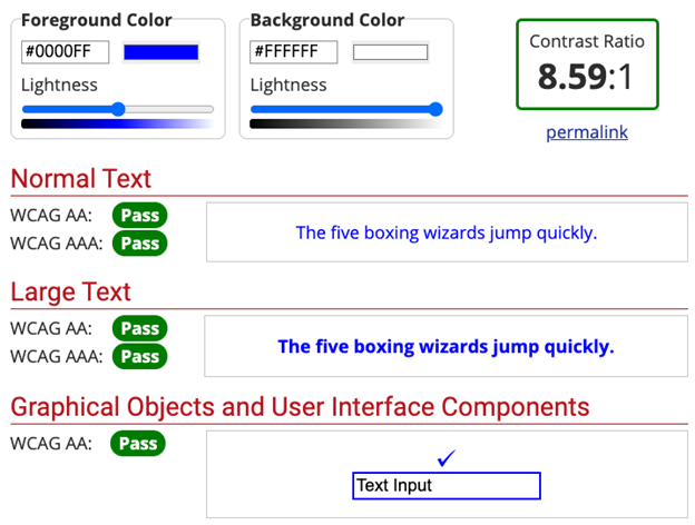
To ensure that your content is easy to see for students of varying color vision types, you must validate the color contrast of your content against its background color. Use tools like WebAIM’s color contrast checker and add your hex codes in the foreground and background form fields.
When testing your colors with this tool, you should see the exact color ratio of the combination of colors you have applied, and the A-rating met with different text sizes and content types. There are many other great tools to check for color contrast, so be sure to use what works best for you! If you ever need a reminder, here are the color contrast ratios that need to be met to meet the bare minimum contrast requirements:
- Text should have a color contrast ratio of at least 5:1against its background.
- Large-scale text should have a contrast ratio of at least3:1. Large text is greater than 14pt and bold, or 18pt or larger.
- The contrast of links, icons, and graphics should be at least3:1 against its background.
- If text is part of a logo or is purely decoration, then there is no contrast requirement.
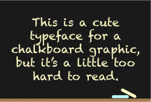
Text Styling
Even with good color contrast, it’s essential to style text in a way that is easy to read. As a designer, I know it can be hard to let go of our cute and quirky typefaces, but remember that reading comprehension is far more valuable. Use these tips sourced from Harvard for accessible text styling:
- Try to choose typefaces (or fonts) that you know are easy to read.
- You want to avoid using all caps, especially for large bodies of content. Readability is reduced with all caps because it forces all words to have a uniform rectangular shape, meaning readers can’t identify words by their unique shapes.
- Remember that most western readers have the most natural time reading content that is left aligned, avoid using justified, centered, or right-aligned text.
- Provide the right amount of space between lines of text (This is usually applied by default in most content editors)
- Don’t put two spaces after a period.
With any of these points, remember to use your best judgment with text styling. If you find yourself wondering if something is difficult to read, chances are it is. As you hand content to your students, try to give it to them in a format they can modify with unique fonts, colors, or sizes. I would recommend using your LMS or giving them an editable document for this purpose. As someone with dyslexia, I love it when teachers do this because I can apply my favorite font for reading, Open Dyslexic, to the materials.
Writing Better Alternative “Alt” Text
When it comes to using images, many of us have heard of the importance of adding alternate, otherwise known as alt, text. Alt-text is a way to describe an image so that people who cannot see it can understand. Nearly every LMS, third-party app, and document creator allows you to add alt text to an image.
But let’s dig into alt text further: I’ve seen so many instances where alt text is applied to an image, but it doesn’t helpfully describe it. When thinking of what to write for alt text, we need to ask ourselves WHY the image is included. Alt text should not just describe an image, but also provide context to

For example, if I use an image to discuss my cat Onyx’s cuteness, I would want to use alt text that would support that context. Instead of saying, “A black cat sleeping,” what I might say in this context is “Anna’s black cat, Onyx, snoozing peacefully on a blanket.” With that combination of cute image and endearing alt text, who could deny Onyx is adorable?
Apply Alt Text Everywhere Except…
Decorative Images

One situation in which we don’t need alt text is for purely decorative images. In the example above, there is an embellished divider that we might use between paragraphs. But this image doesn’t serve a purpose other than embellishing the page, so there’s no reason to add alt text to it.
Scanned documents
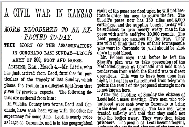
In this example, we have a scanned historical document. But the problem with this is that since it is an extended amount of text, we can’t add alt text to it without losing the entire context. In this case, we need to provide an alternative document with all of the content from this article available programmatically. This can end up being highly problematic for historical records, but pull from your campus resources here to help type up documents that do not have the existing programmatic text available.
Remember that some of these documents are used for decades, and the sooner we can make their content available for screenreaders and other tools, the better. As I mentioned, I have dyslexia and have often wished to use text to speech software on documents like these to make it easier to process their content.
Highly Complex Images
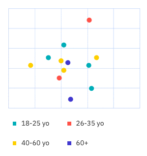
Similarly, alt text should not be added to images that are too complex to describe. alt text should be brief, so if the image is too complex to describe in a sentence or two, you will need to provide an alternative. This commonly occurs when displaying data. When this happens, try to offer accommodations like a spreadsheet that contains the same data, or describe the data in detail on content nearby.
I know all of this alt text information may be a lot to digest right away, but you don’t have to memorize it. I would recommend using this alt text guide from W3C as a reference.
Providing Captions and Transcriptions
Last but certainly not least, we come to captions and transcriptions. These are two different ways to convey video and audio information. Transcription is when speech or audio is converted into a written text document, whereas captioning divides transcript text into time-coded chunks, known as “caption frames.” For your hard of hearing or deaf students, we must provide content that has captions, transcriptions, or both.
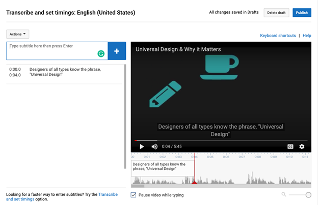
Use the following tips as a guide for captions and transcriptions:
- Captions should be included with videos.
- Transcriptions should be provided for audio-only content (for example a podcast)
- In transcripts, include a description of helpful visual content (for example “Anna leaves the room”)
- Captioning and transcripts should be provided when a live event occurs (for example, a webinar). If you are unsure if captions and transcriptions are available, it’s always okay to contact the event coordinators to ask that they make accommodations.
- Ensure that captions and transcriptions are at least 97% accurate
How captions are added can vary depending on the platform you are using. I will mention that YouTube will be your easiest bet for captioning videos if you are adding captions yourself. YouTube even generates captions automatically, but we still have to review these captions for accuracy as YouTube does not create perfect captions. The margin for error is very low. Research shows that the comprehension rate of captions drops dramatically when error rates go over 3%. This means that your captions and transcriptions need to be 97% accurate to be effective.
Next steps
I haven’t explained the details to implement accessible content in specific tools because each of you is likely using a different toolset related to your courses. To build on this topic, I want to give you all some direction on the next steps to further your knowledge as it suits your specific needs.
I highly recommend this Coursera course, Basics of Inclusive Design for Online Education, developed by my colleagues at CU-Boulder. This course is free to audit, and it goes in-depth into how to implement accessible course design in specific tools such as Word, Powerpoint, and PDF. It’s 100% online, self-guided, and easy to pick up when you can. I would highly recommend it, even if you sign up to pick up tips as you go.
I assume that you came to this article to learn everything about accessibility in course design, but the reality is all of us are always learning more. I’ve been specializing in inclusive design for over eight years, and I am still learning new things every day. The trick to long-term accessibility improvements in your courses and everywhere else is to keep listening, learning, and iterating.
A considerable percentage of making your course accessible comes down to working with your students and listening to feedback, so you want to ensure your students feel comfortable coming to you when they have a need. If you’re ever wondering if your materials are accessible, the easiest way to know is to gather feedback from your students continually.
I want to step back and talk for a second about the primary reasons that I see people not considering accessibility. Most of the time, it’s because we don’t know how or are afraid to mess up. There have been so many instances where I’ve worked with people who care about accessibility but have let it slide because they don’t have the time and resources to learn how to be perfectly accessible in their course design
I know that it feels like a lot of us are expected to be instructors who know everything about our subject, be counselors to students in need, and be savvy enough to keep up with new tech trends. In these weird COVID times, I know that pressure is higher than usual. But we are just people, and all we can do is our best, especially nowadays.
We are eternal students ourselves, so step into developing your accessibility prowess with the amount of patience you give to your students.
About Author
Anna E. Cook is a Senior Product Designer and Instructional Designer. Since 2012, Anna has specialized in building inclusive experiences and creating scalable systems to support accessible practices in both product teams and educational environments. Anna has hands-on experience teaching both educators and students alike and is a passionate advocate for universal design thinking in all aspects of her work. In her free time, Anna is currently furthering her education by pursuing her Master’s of Science at the ATLAS CU-Boulder.